The target consumer: We launch a new tea drink and we want the packaging and related identity'
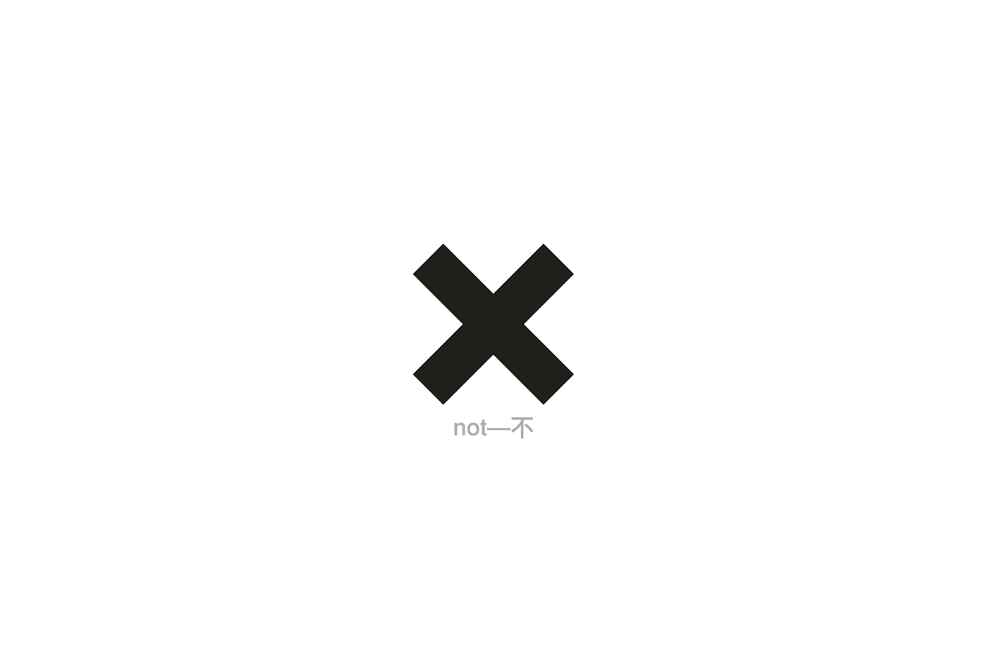
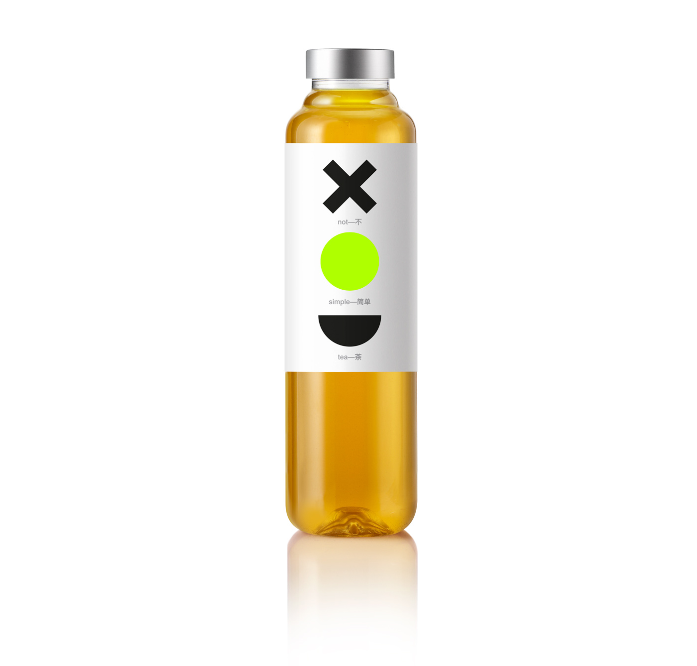
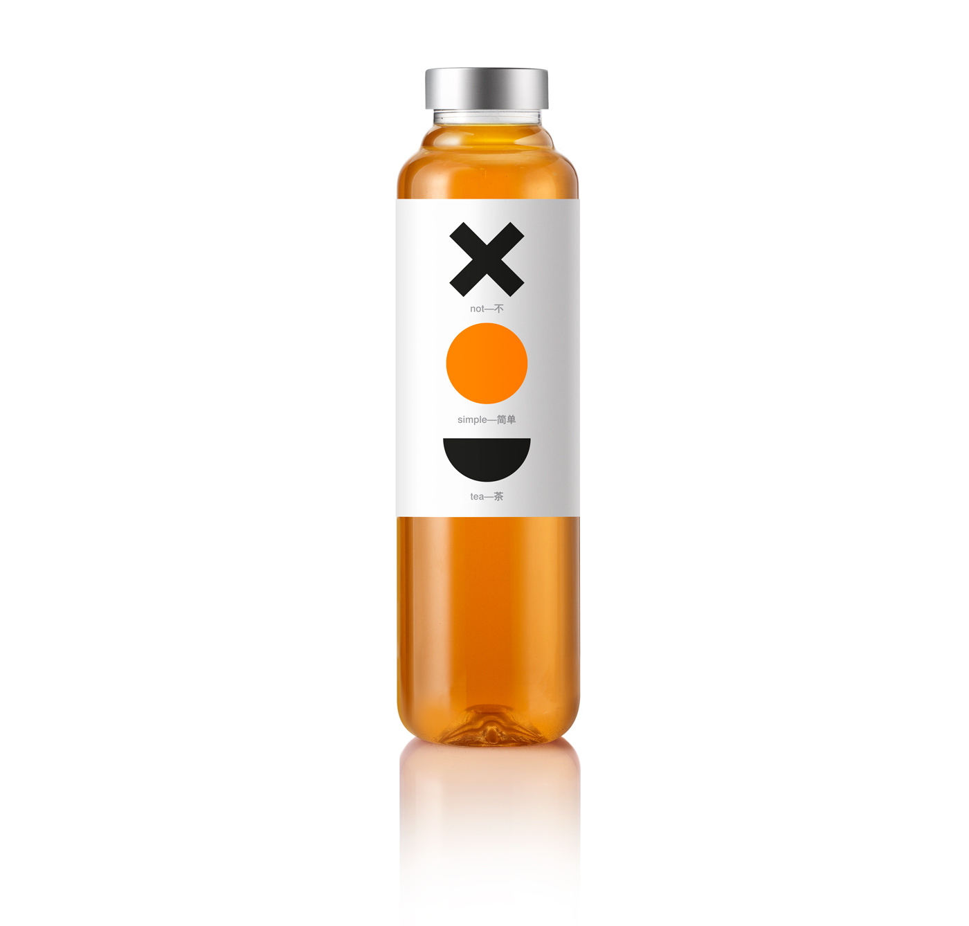
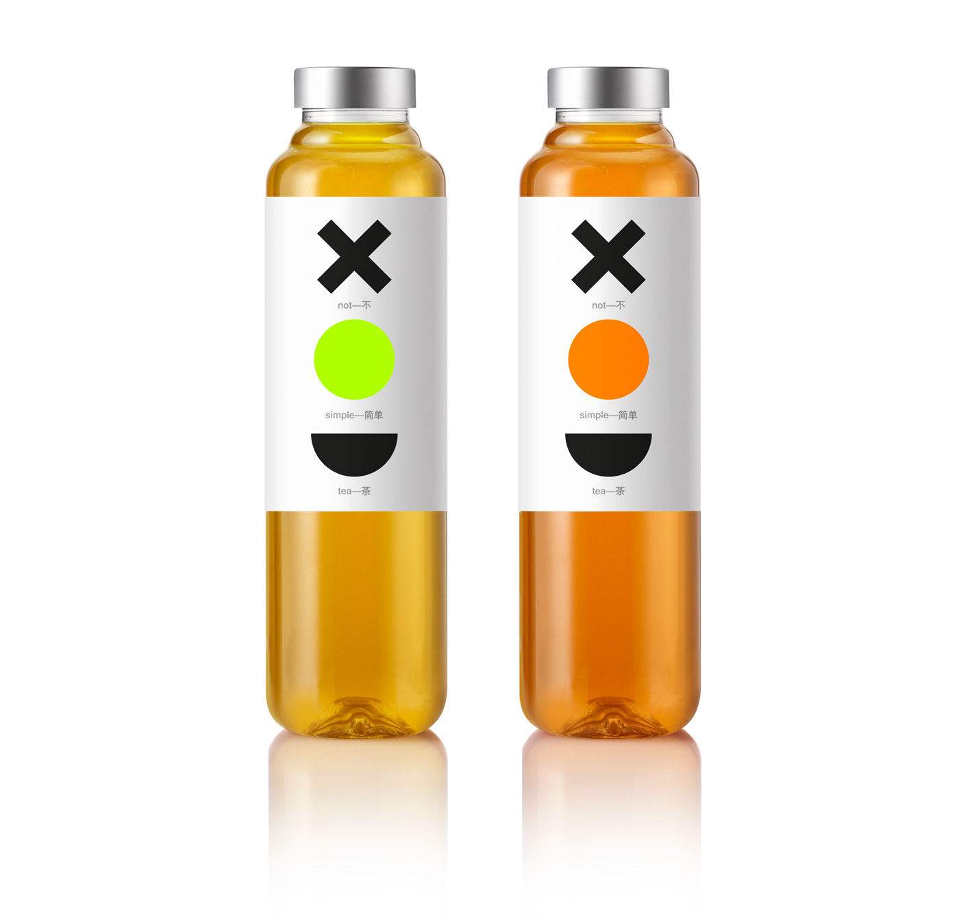
The design: Tea drinks constitute a highly competitive market in China. Our client briefed us with a product name that became our basic identity vehicle : 'Not Simple Tea'. We created a code out of ordinary shapes that directly and efficiently translate this name in visuals: X for 'Not', the universal shape of the circle for 'Simple' and the semi-circular shape of a pot for 'Tea'. The product, available in green tea and oolong tea flavors, is strongly identified in two colors and 3 languages, (the Chinese, the English and the visual). The brand identity is identified with this process of translation in a dynamic way and design is affirmed as an exercise in communication.