new account
work
studio
© mousegraphics 2026
Athens-Greece
Mantelou 13 & Agiou Serafim,
145 64 Kifisia
+30 698 8357323
+30 210 6201093
[email protected]
contact
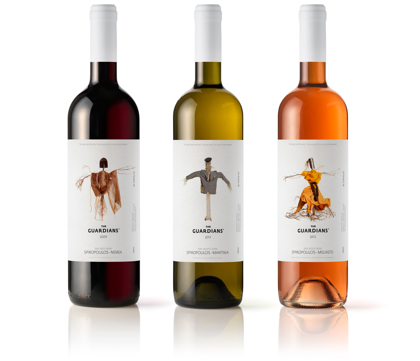
THE GUARDIANS* red - rose - white wine
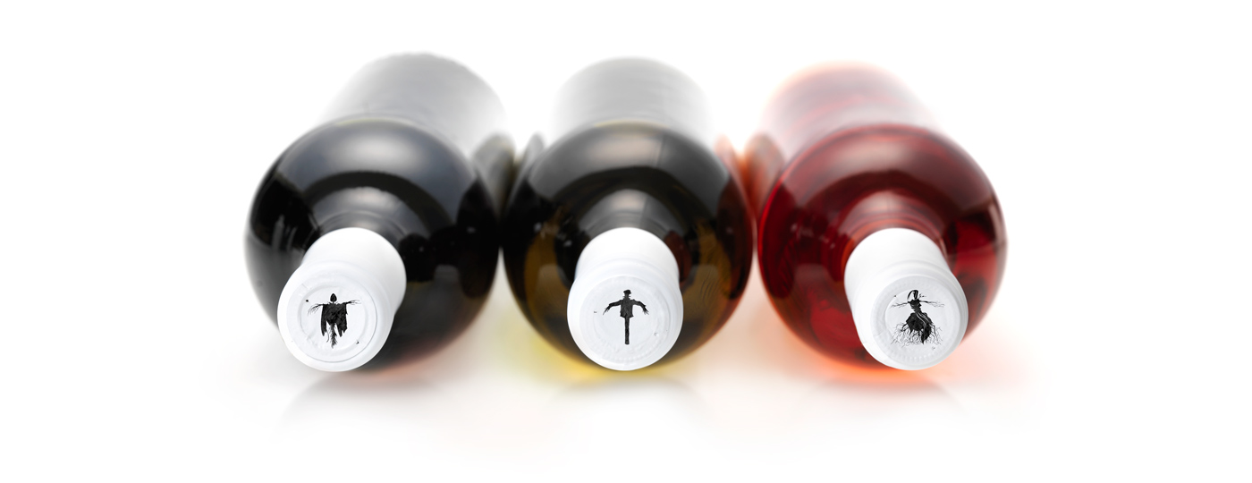
THE GUARDIANS* red - rose - white wine
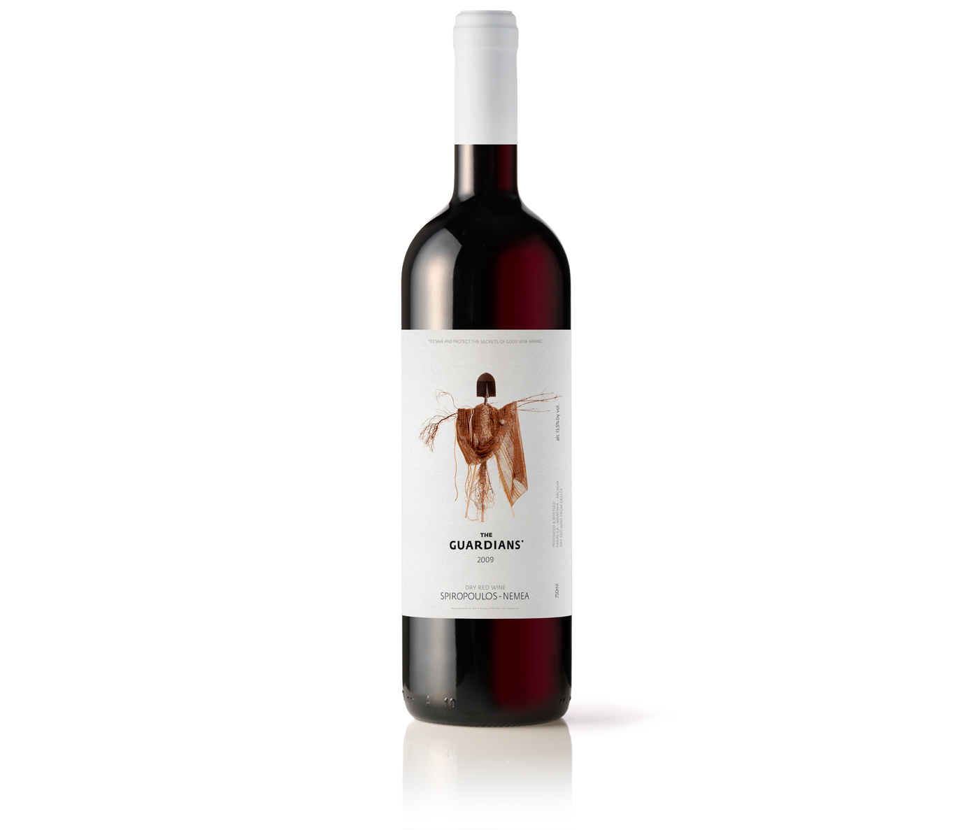
THE GUARDIANS* red wine
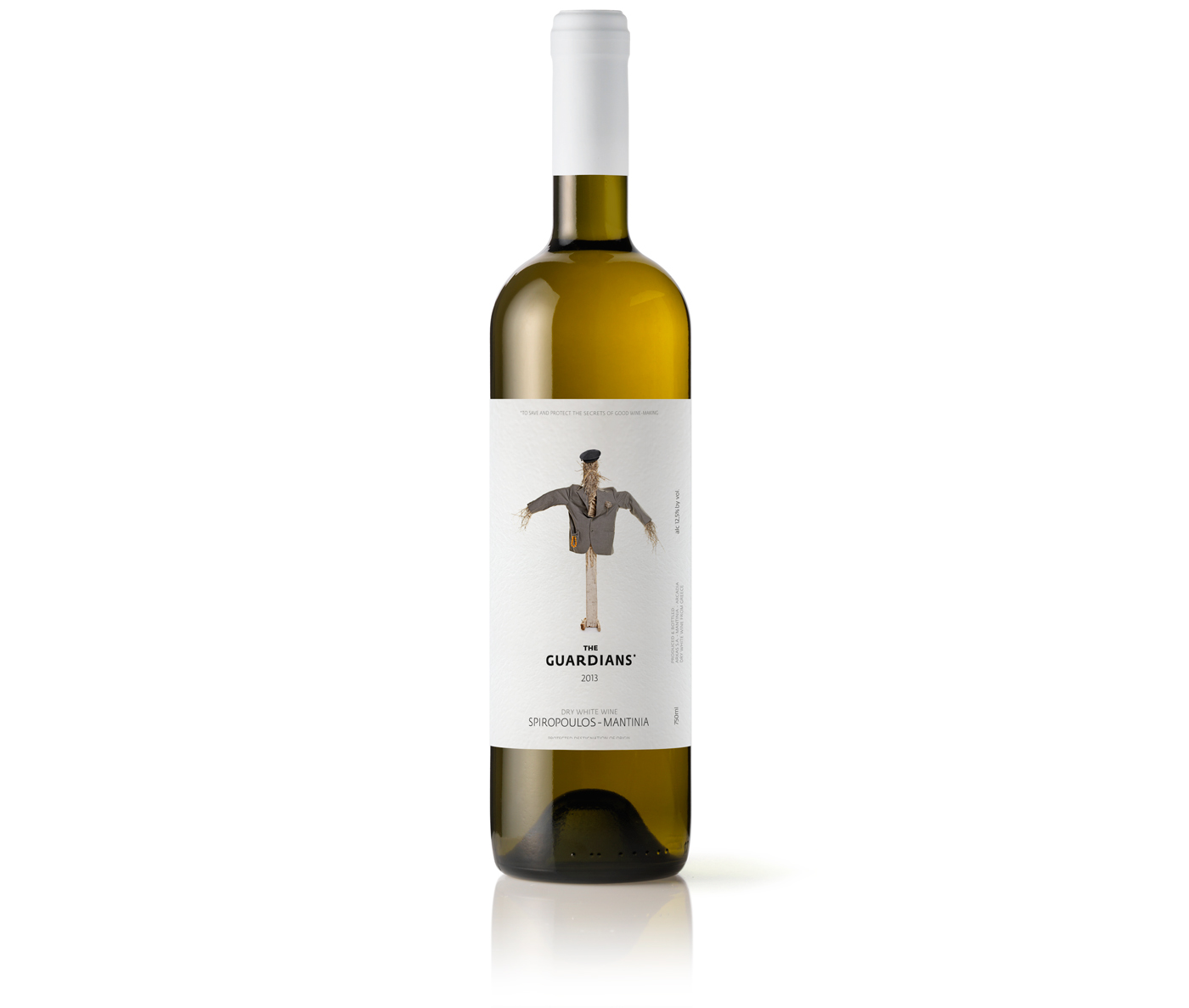
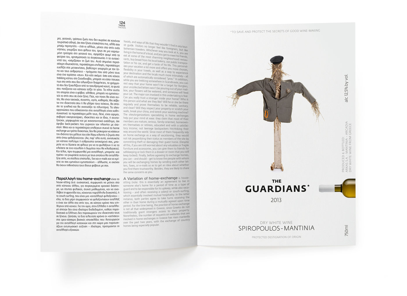
THE GUARDIANS* white wine
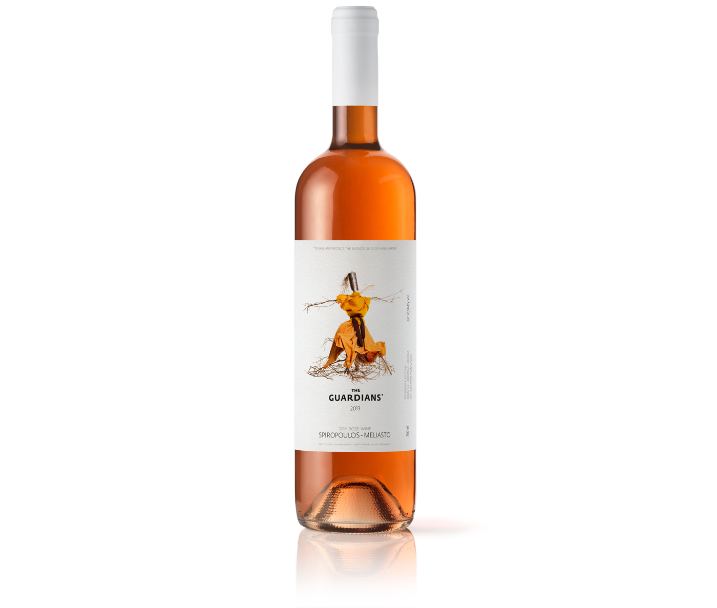
THE GUARDIANS* rose wine
THE GUARDIANS* print advertising
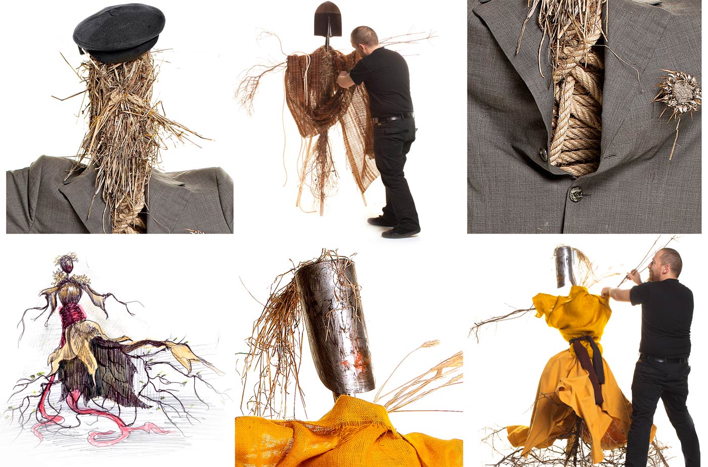
THE SCARECROW* making of