The design:
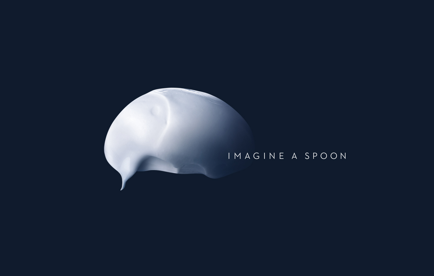
Oikos is a brand of creamy natural yoghurts inspired by authentic Greek recipes and the deep sense of pleasure enjoyed in a familiar environment where everything is possible: all you need to do is imagine a spoon
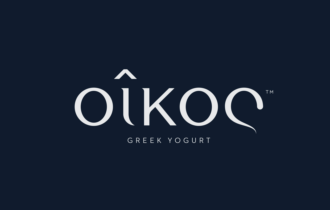
The logo:
Oikos means ‘home’ in ancient Greek.
Blue series:
‘Extra creamy’
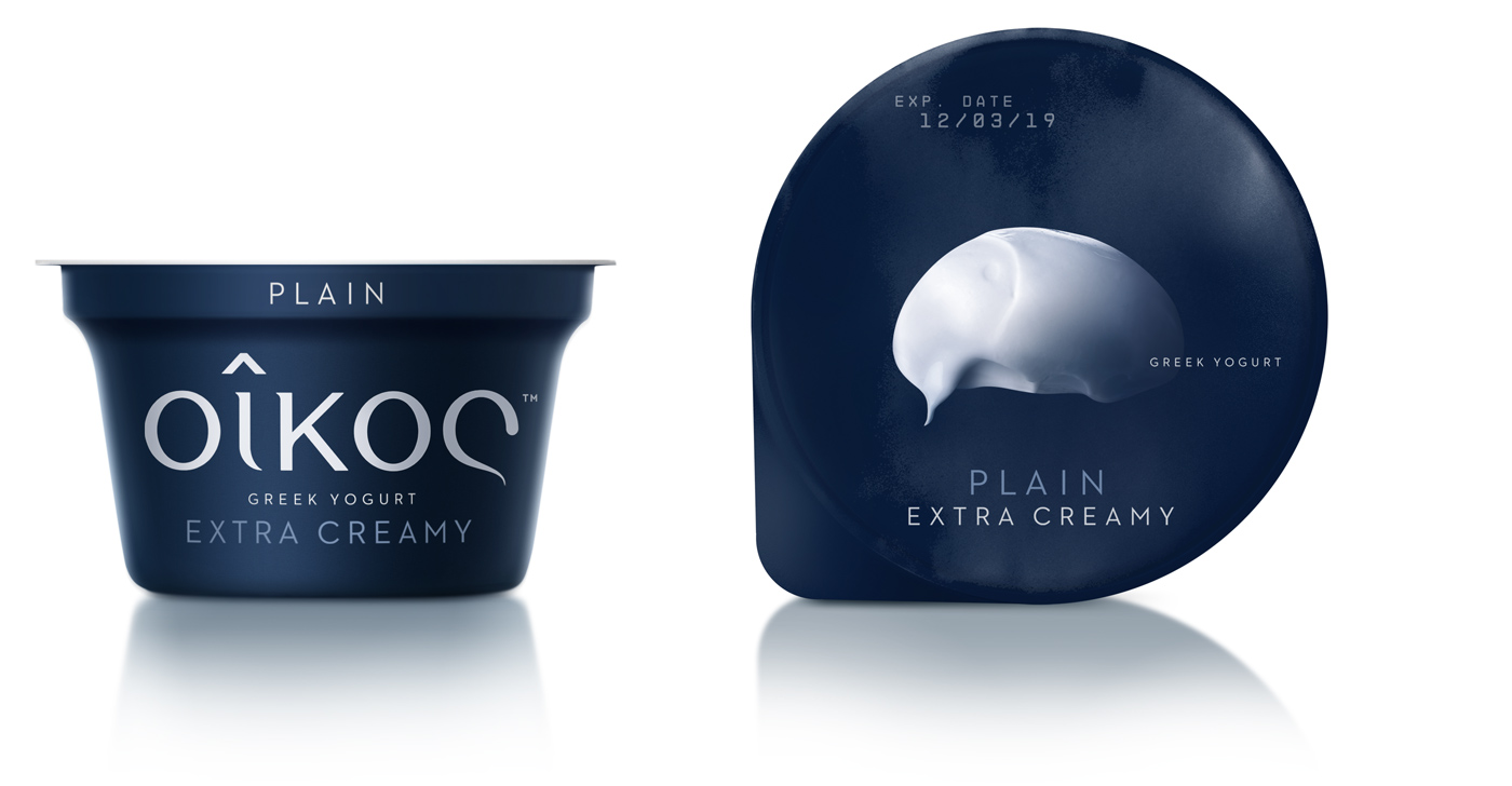
cup & lid_plain
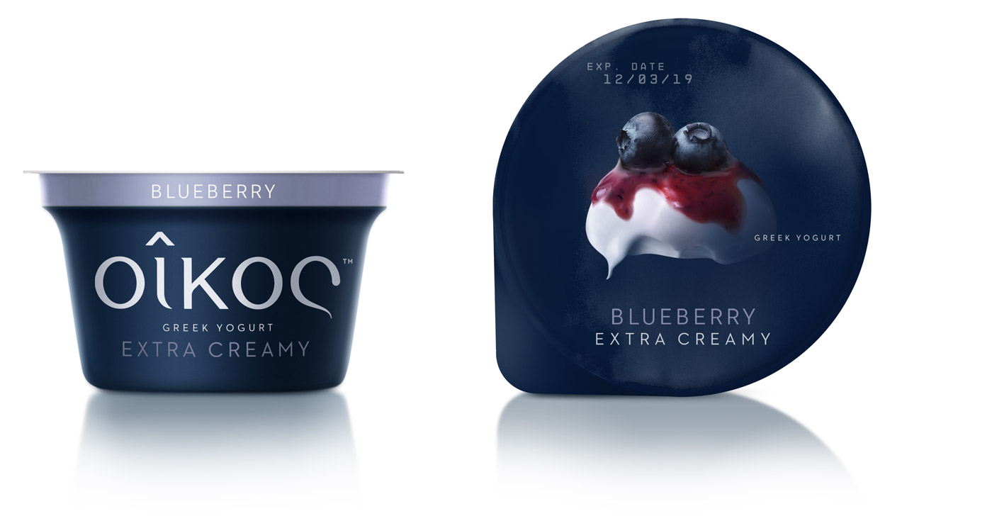
cup & lid_blueberry
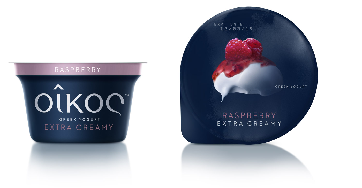
cup & lid_raspberry
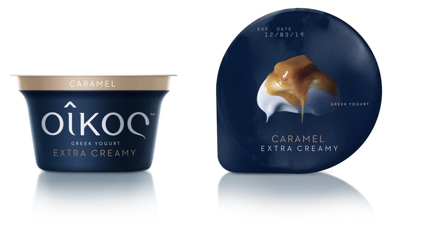
cup & lid_caramel
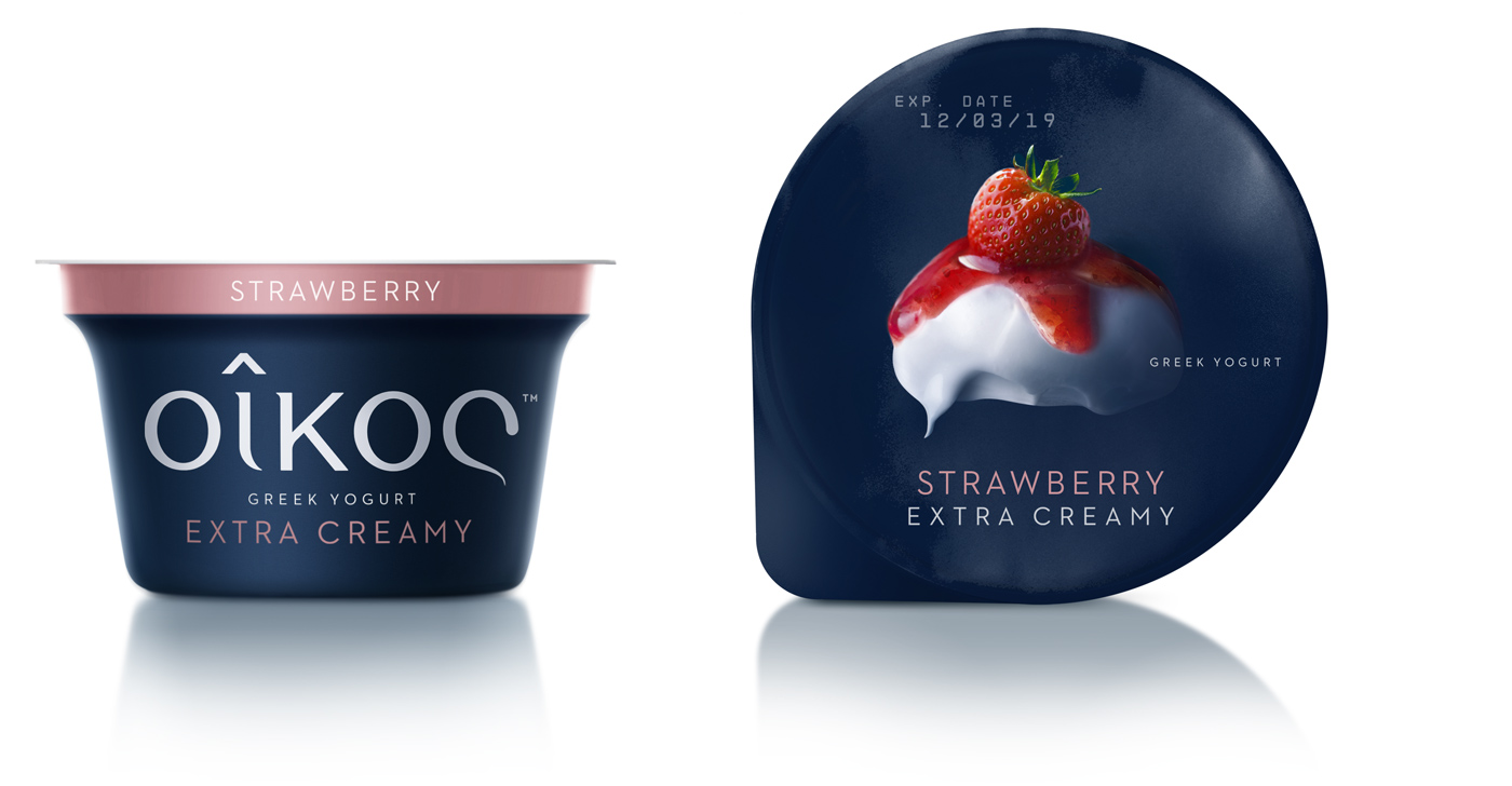
cup & lid_strawberry
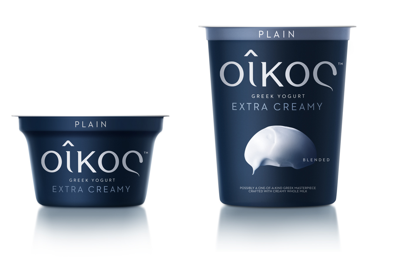
small & big cup_plain
Black series:
This particular, premium set of gourmet oikos desserts demanded a holistic understanding of exclusivity
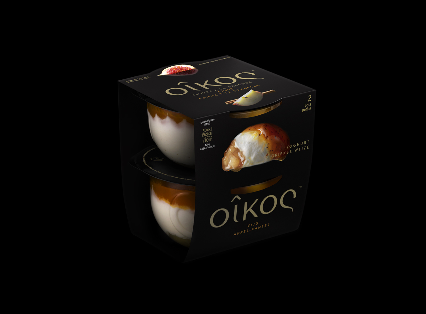
3 layers
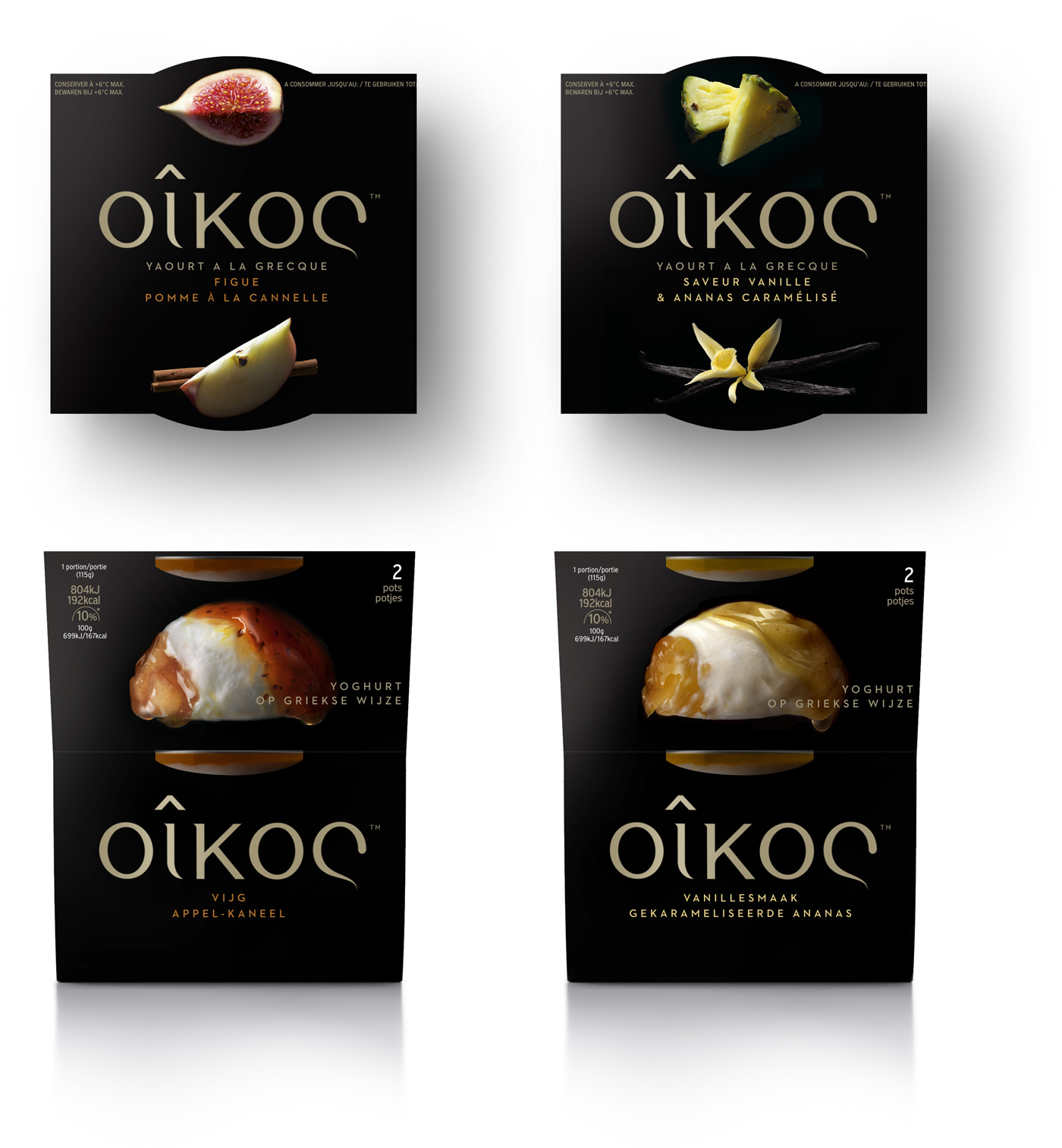
3 layers_ top & Side
Black series:
‘Almond-butter indulgence’
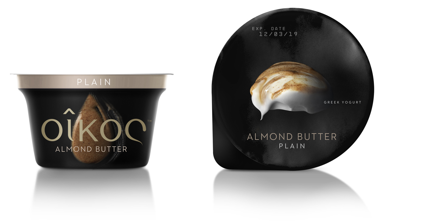
almond butter_plain_ cup & lid
.jpg)