new account
work
studio
© mousegraphics 2026
Athens-Greece
Mantelou 13 & Agiou Serafim,
145 64 Kifisia
+30 698 8357323
+30 210 6201093
[email protected]
contact
moo 360°
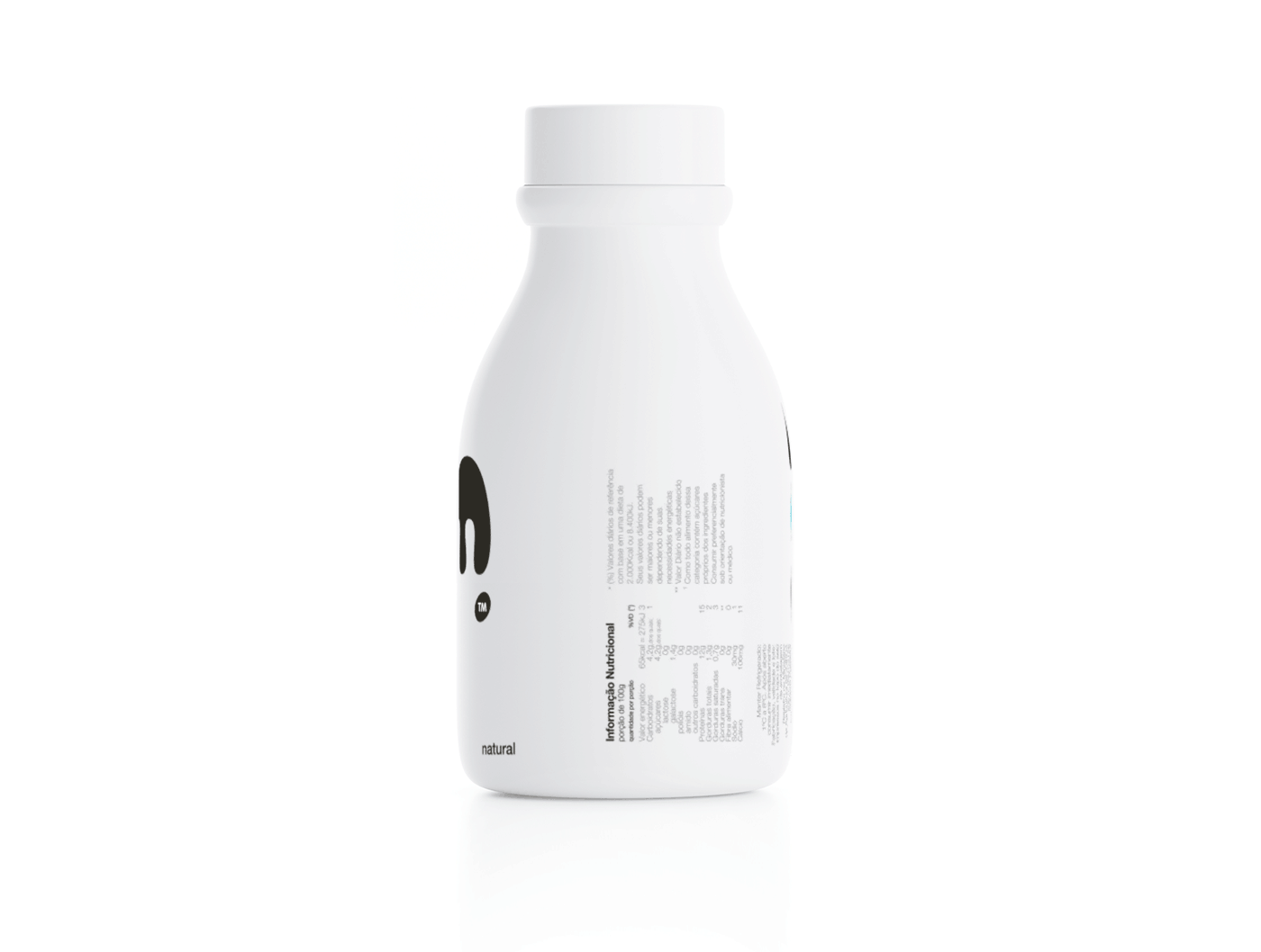
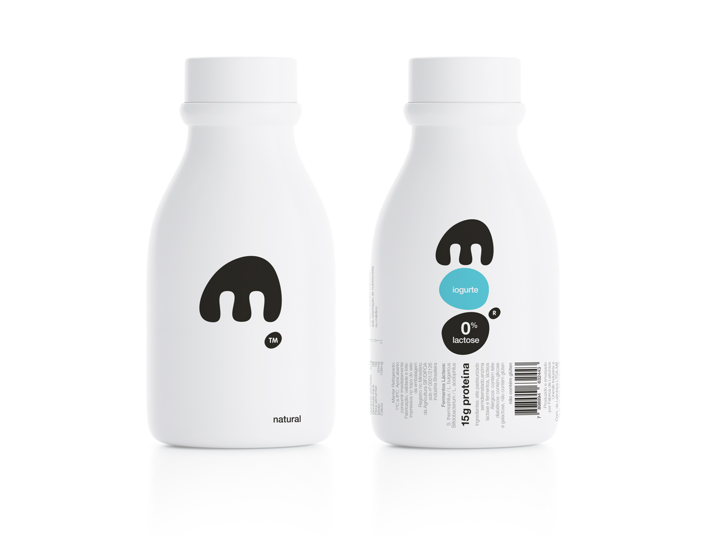
back and front
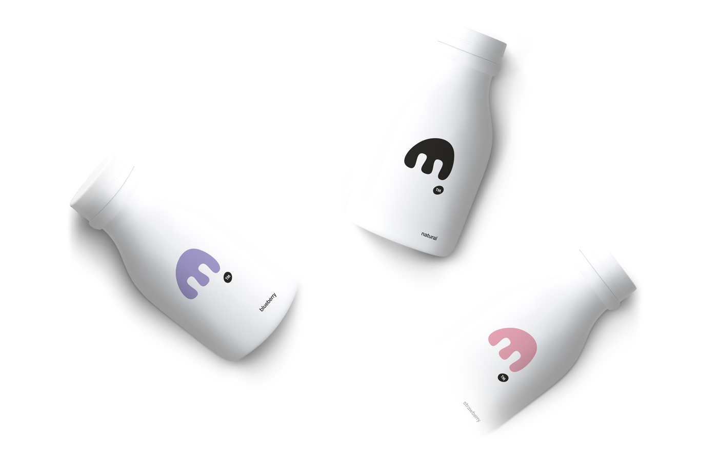
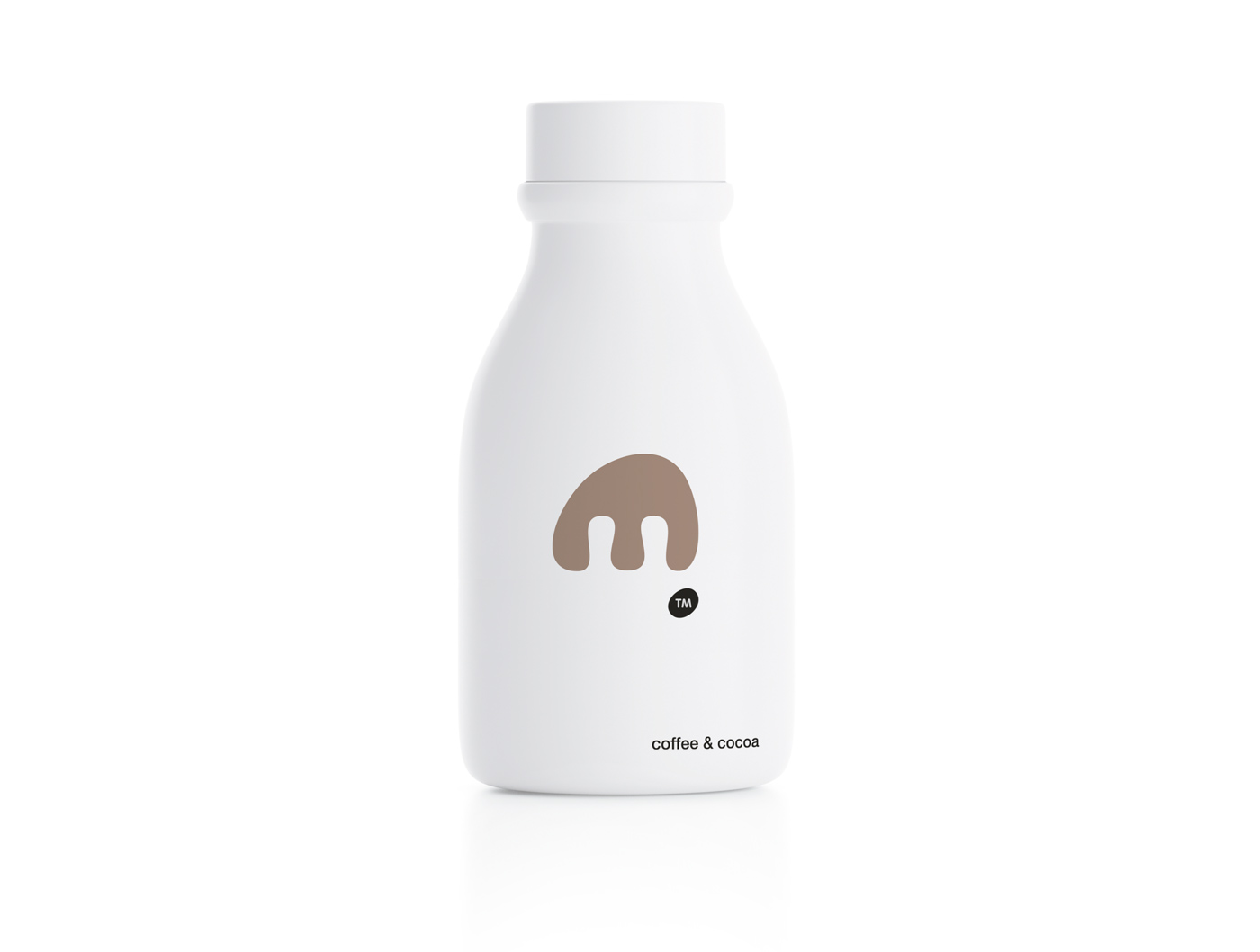
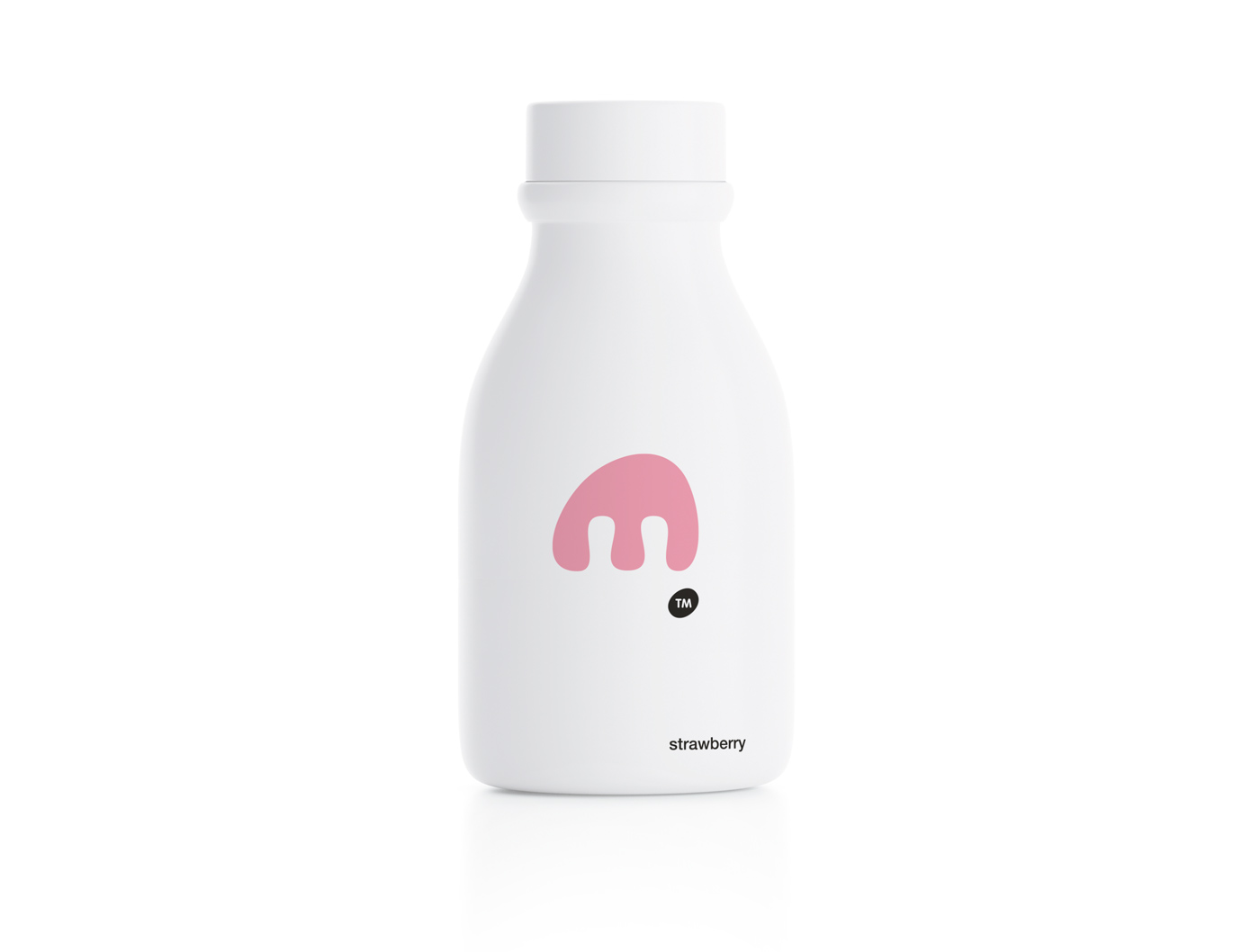
moo range
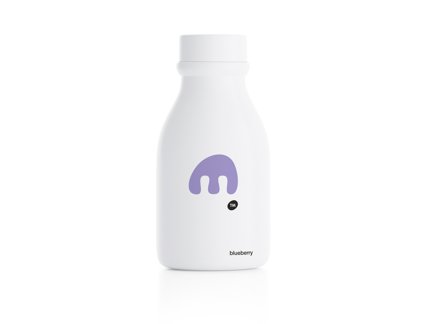
back of blueberry
back of cocoa
back of strawberry
full range
.jpg)