new account
work
studio
© mousegraphics 2026
Athens-Greece
Mantelou 13 & Agiou Serafim,
145 64 Kifisia
+30 698 8357323
+30 210 6201093
[email protected]
contact
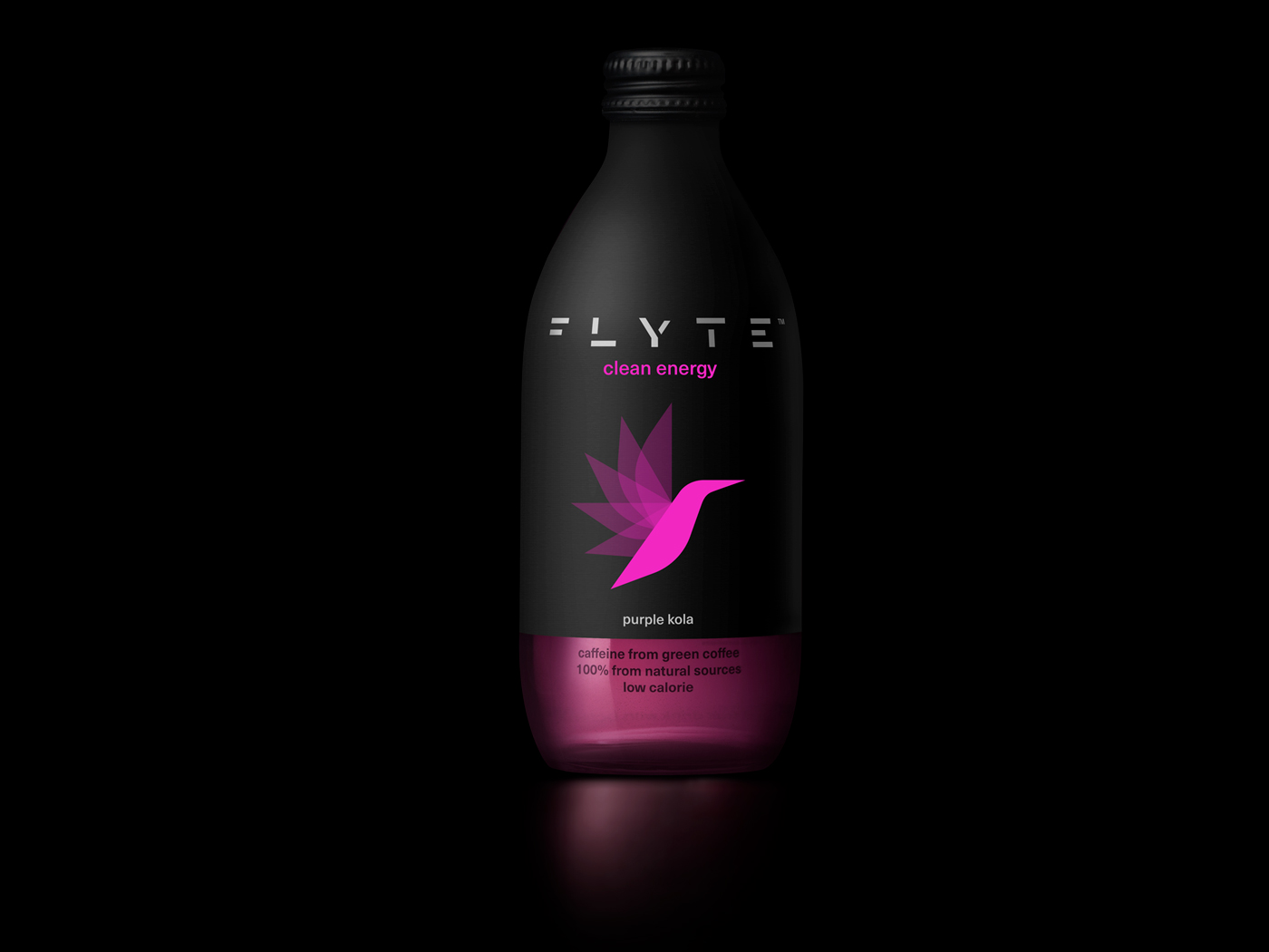
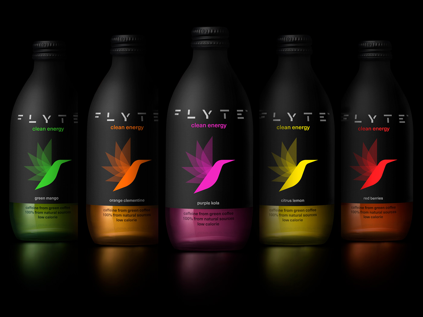
purple cola
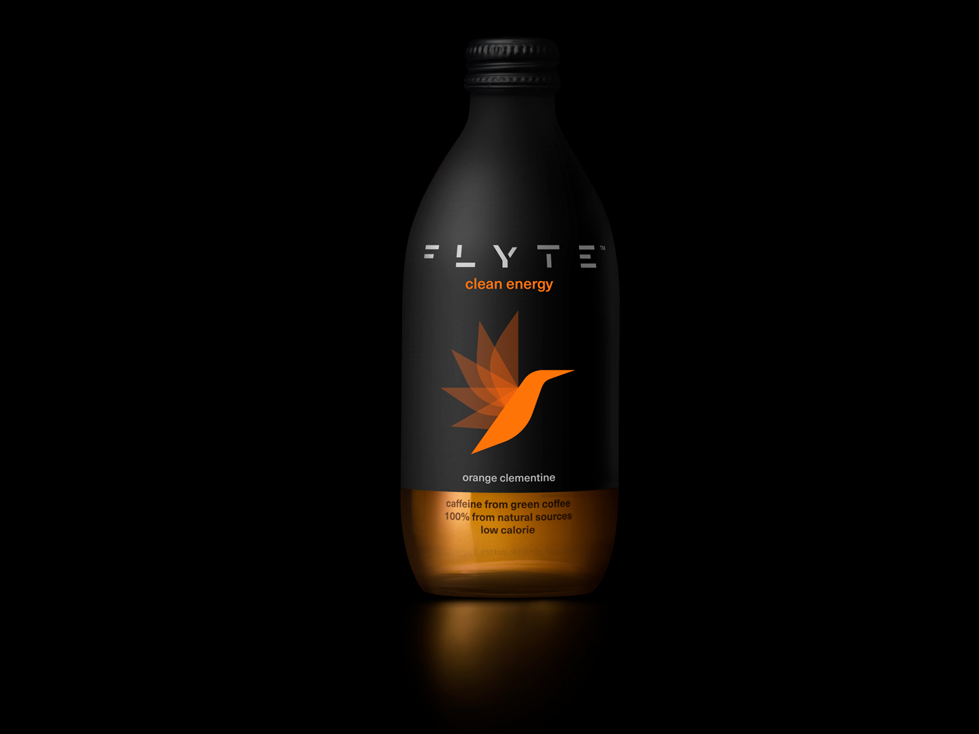
orange clementine
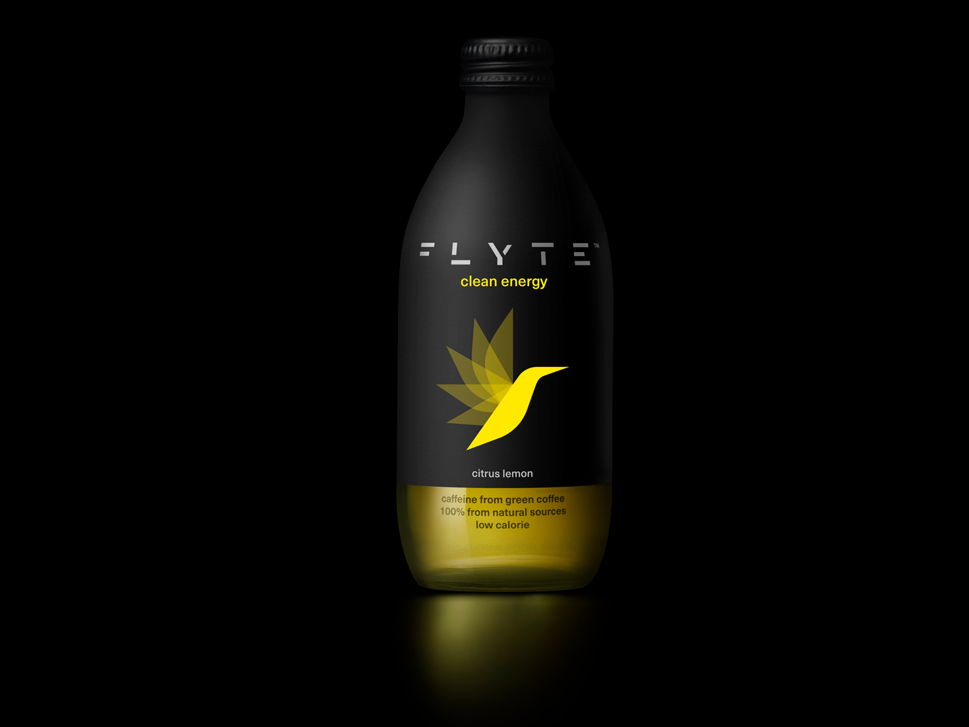
citrus lemon
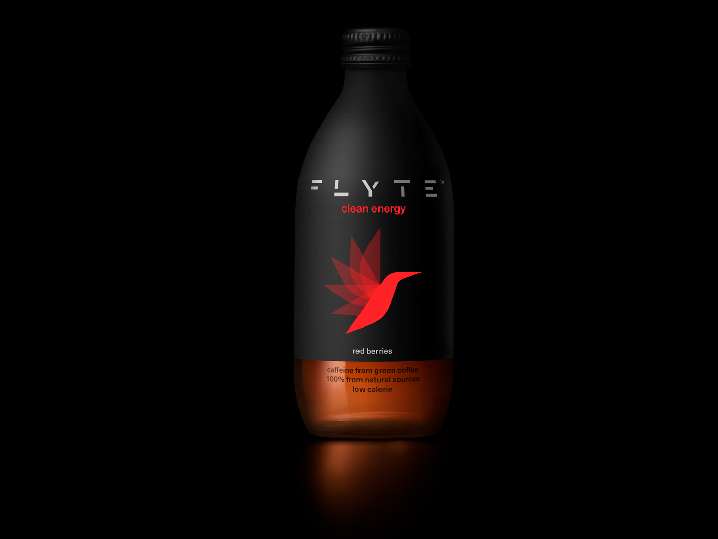
red berries
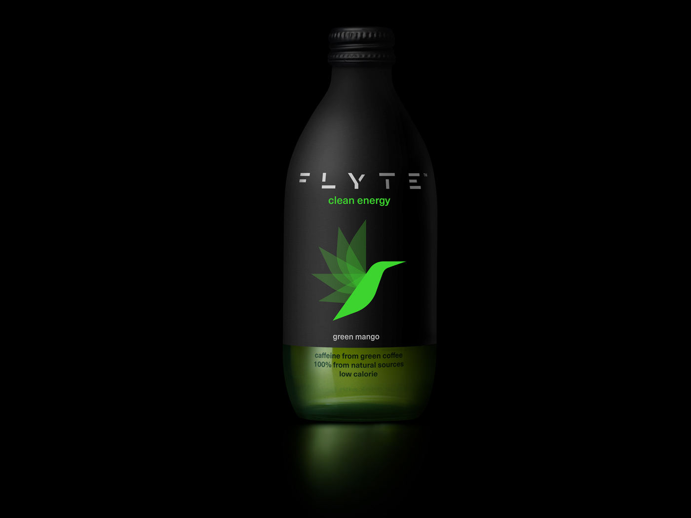
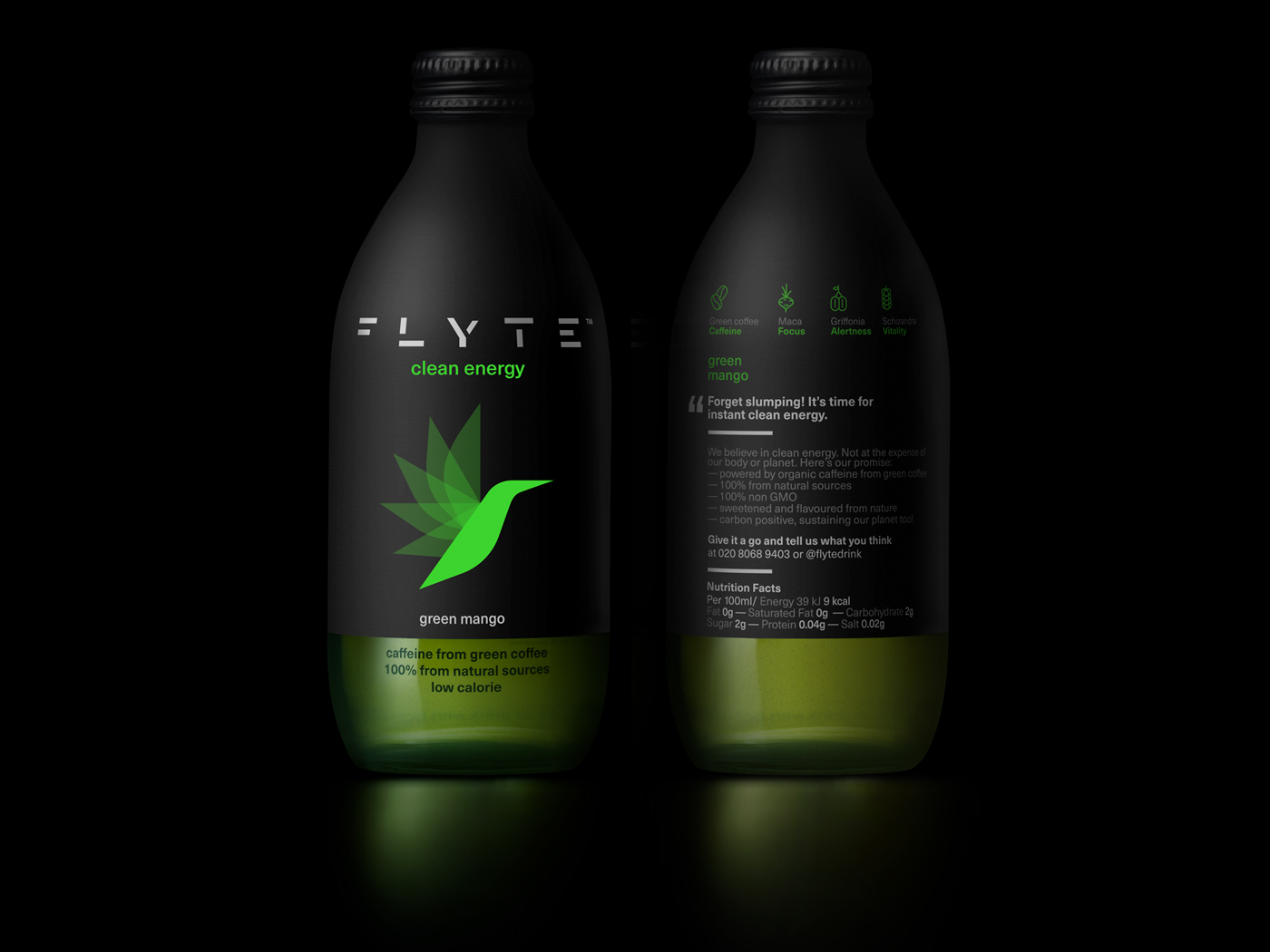
green mango
front & back
the full range