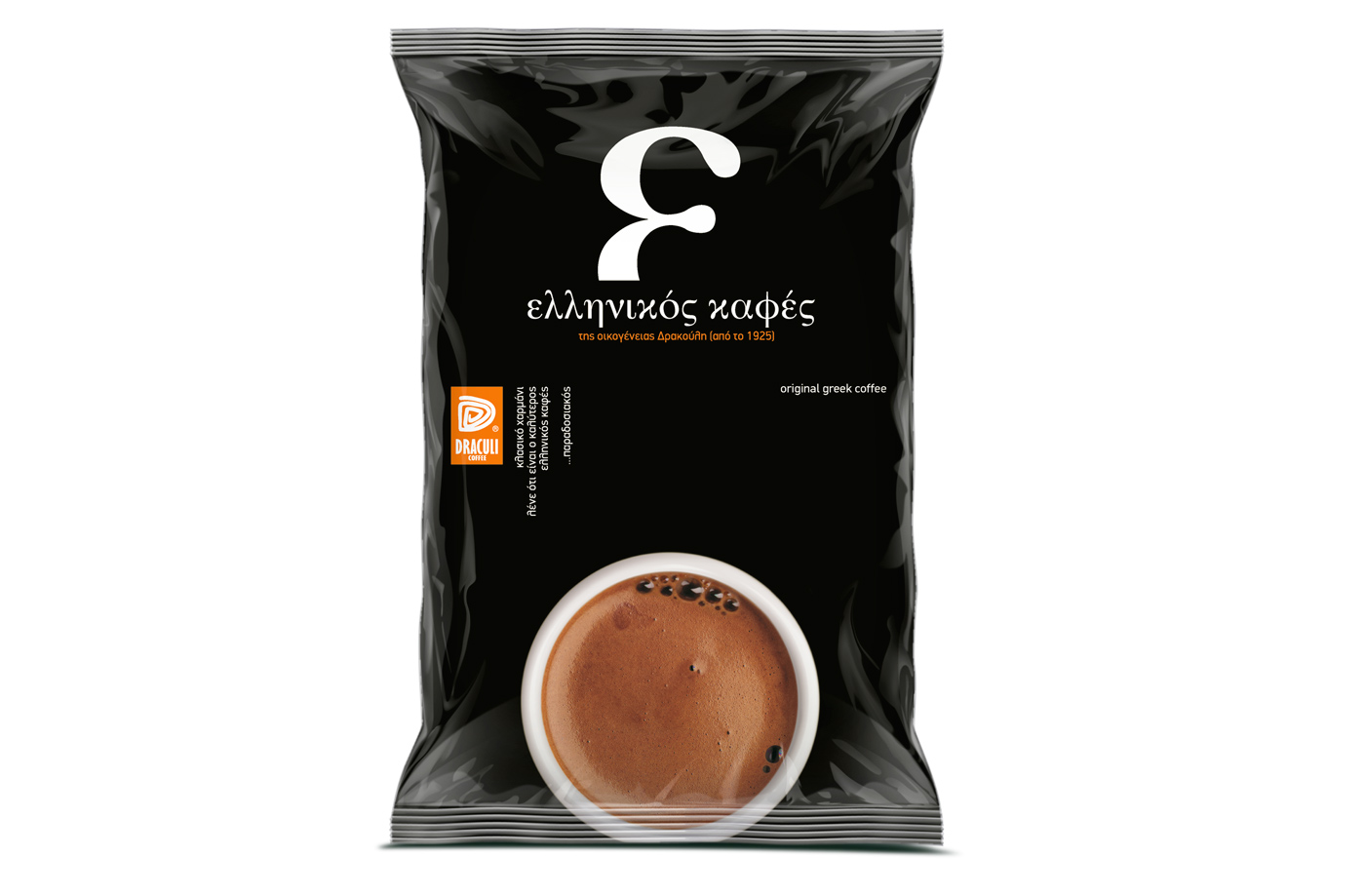
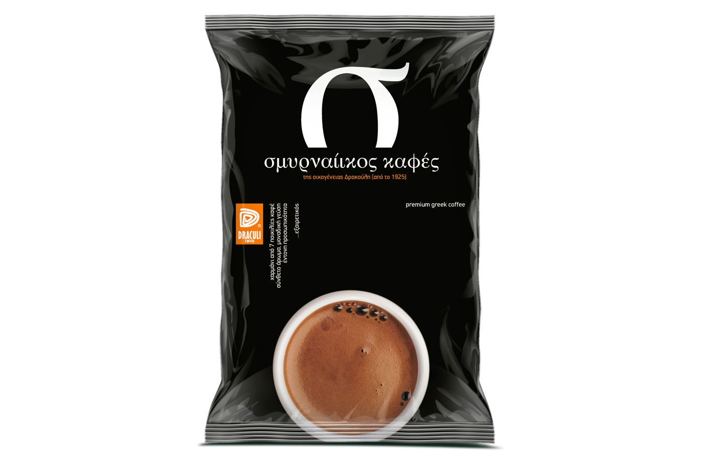
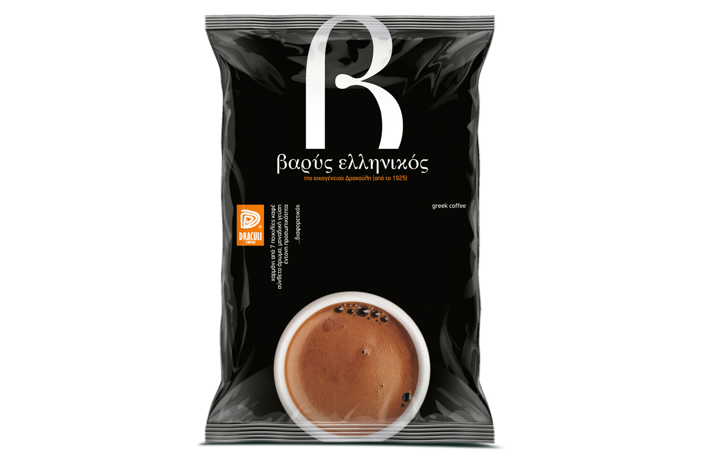
The target consumer: Somewhat younger ages, people ‘revisiting’ greek coffee, not as their parents or grandparents cupper, but more of their own new greek style.
The design: We opted for the obvious: An appetizing coffee cup (… yes, there is a measure of ‘appetite’ in Greek coffee), a simple black pack to imply full taste and the use of Greek alphabet letters as initials for each coffee type: ‘ε’ for ‘ελληνικός’ (hellinikos / greek), ‘β’ for ‘βαρύς’ (varys / strong), ‘σ’ for ‘σμυρναίικος’ (smyrneikos / coming from Smyrna). Rich brown velvet texture, traces of boiling bubbles for freshness and a deep black background for the millennia of Greek tradition in writing: one can even get the aroma and the taste of pleasure.