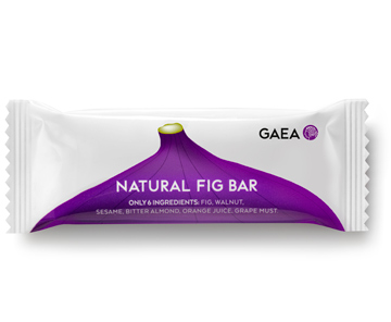
The target consumer: markets around the world.
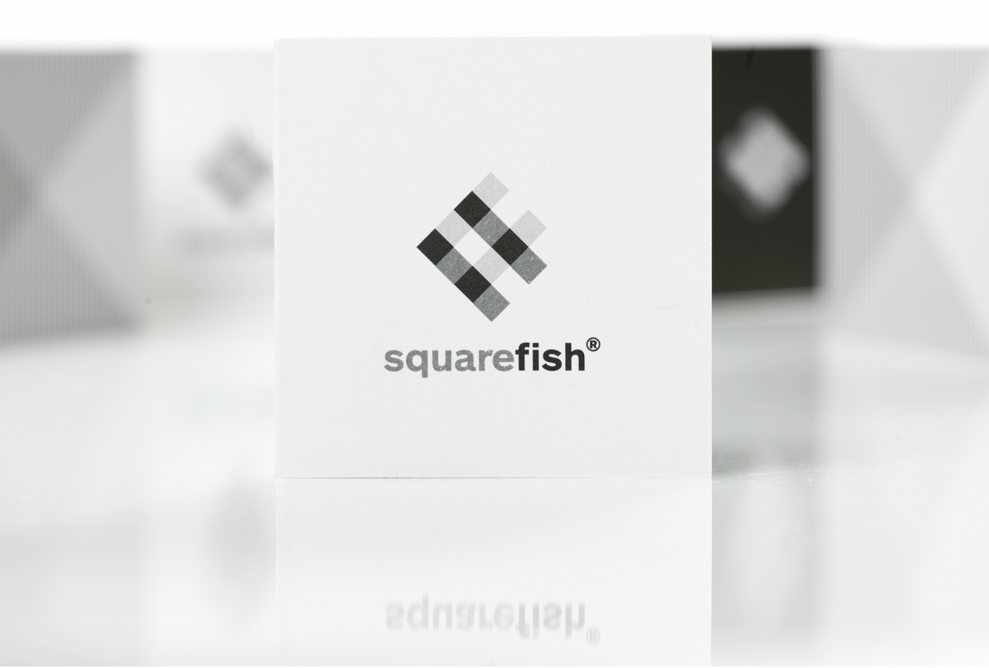
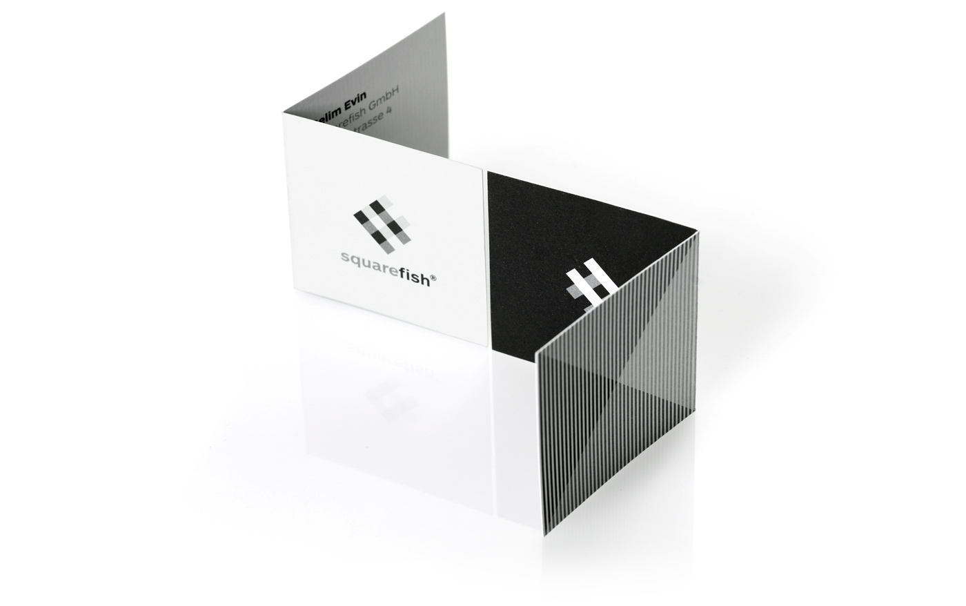
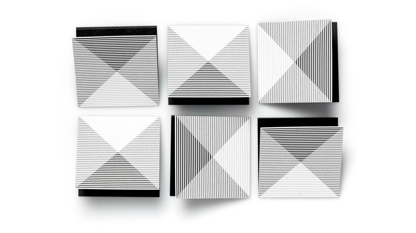
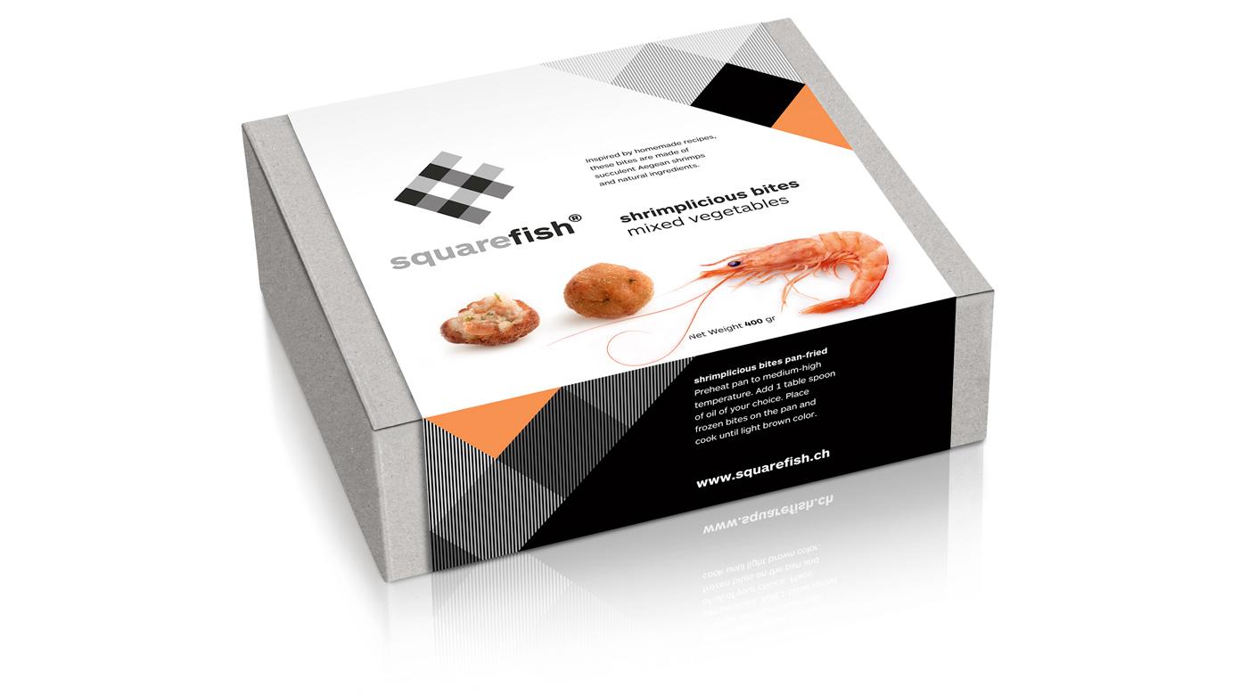
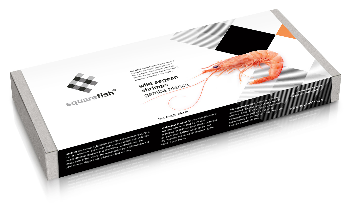
The design: our client is of Turkish origin and distributes his products in Europe, with plans to expand, both in products and markets. Our design cue was the very name of the product and the challenge to make something smart and simple, away from usual food clichés. We zoomed in the basic and universally recognizable table cloth square grid. We cut a corner in the shape of a fish. We enhanced the illusion of movement through the choice of black and white, an op art effect, based on the dynamic relationship of pattern and line, foreground and background. Photographs of the actual shrimps or their natural environment were placed on our paper kits in order to balance the approach of abstraction we used for the logo and to differentiate sea food types and packaging options.