The plant-based, dairy-free products of the successful brand respond to a specific philosophy of trust and honesty, of localized sources and sustainable processes, of ethical provenance and GMO - free organic ingredients, of fully recyclable packaging and environmentally conscious growth goals.
We used design as a tool through which to rethink this dynamic content and responsible attitude.
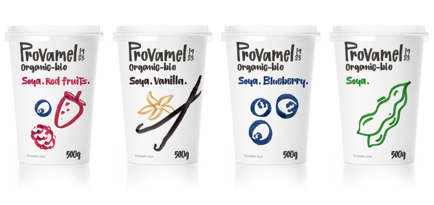
We imagined an identity that would perform values, instead of just representing them.
We developed a new, unique Provamel signature-set of hand-drawn letters which spell out everything, from the brand’s logotype to every ingredient and related info. This emphasis on the gestural - free writing and sketch drawing - corresponds to the brand’s emphatic commitment to a sustainable form of “doing better”, of organically changing and improving.
We cleared the packaging surfaces to make the essential shapes and basic messages breathe and shine, in respect to the consumer’s time and the brand’s wish to share the bare truth of its recipes.
We used earthly colors and organic forms as a sign of the brand’s anti-artificial choices.
We treated Provamel like an eco-system rather than a brand, and thus got rid of all brand-design preconceptions to move toward an idiosyncratic, anti-corporate look that directly engages with the brand’s story line: “Know what you eat and eat what you know”.


.jpg)
.jpg)